Have you ever wondered which is the meaning of our name?
At first reading, the word ARTEN does not seem to have any logical connection to the items we produce. Actually, it is the union of the words “ARTicoli” (meaning products) and “ENologici” (meaning oenological).
In fact, in the beginning, our production was oriented to the oenological industry, which was the main target in the first years of ARTEN activity, when we produced covers made by cast iron. Then, in 1974, the brothers Alessandro and Enrico Mora decided to substitute cast iron with stainless steel, they officially founded ARTEN and needed a logo.
 The first logo was an idea of Aristide Mora, wHo drew a rough pencil draft. Starting from that intuition, the black and red logo was created.
  The birth of the logo came within the family, which represents the company’s spirit.
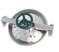
The first logo was often misunderstood and read with the article “Lo” (meaning the) before ARTEN. Actually, it’s the A of ARTEN with just the left rod and, even if it could seem a circle, the red symbol recalls of the shape of our circular manwaydoor. The central bar line of the A makes you think of the arm of the manway.
Because of the possible reading error “the ARTEN”, the Mora family decided to change the logo and they chose tohighlight the initial symbol by putting it into a square, which decontextualise it from the word ARTEN. So, the logo now is made by the original symbol which recalls of a manwaydoor and the name “ARTEN”.
The third and latest version was made to modernize the logo according to a more contemporary style, to make it nicer to watch.
In order to protect our products and our Made in Italy quality and to avoid an illicit use of our logo, ARTEN has been a registered trademark since 1975.

